CODIO AI

Creating a Structured, AI-Powered Workflow for Smarter Medical Coding.

Codio AI is a B2B SaaS platform that helps healthcare organizations process medical charts using AI—helping coders work faster with fewer errors.

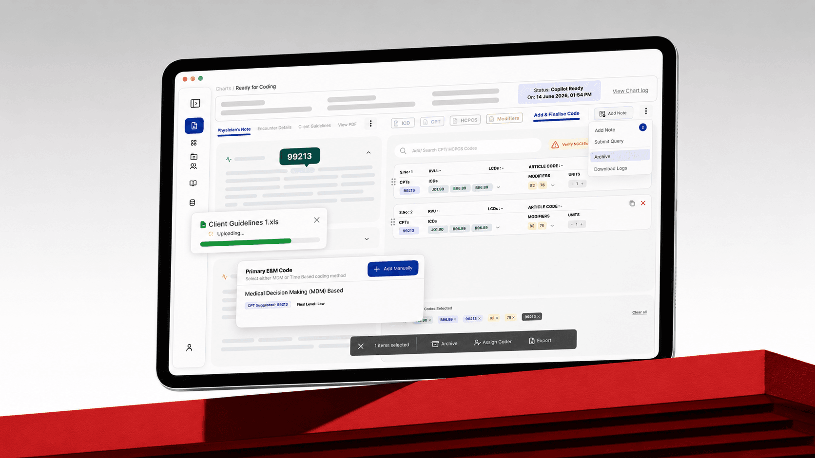
Codio AI medical coding workspace displayed on a large monitor

Interface content has been recreated to respect NDA constraints.

THE PLATFORM

AI-assisted coding built around real clinical operations.

The system reads patient data from electronic health records and suggests accurate CPT and ICD medical codes. Version 2.0 had functional features but lacked structural clarity: navigation was confusing, workflows were hidden, and the interface had no consistent visual language.

Version 3.0 was not a visual refresh. It restructured how the product worked—from operational workflow visibility through the chart coding and finalization experience.

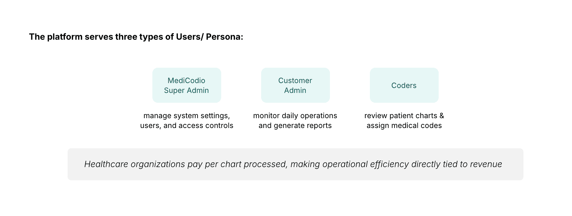
PLATFORM USERS

Codio AI user personas: MediCodio Super Admin, Customer Admin, and Coders

Healthcare organizations pay per chart processed, making operational efficiency directly tied to revenue.

Turning scattered complaints into research direction.

The first signals came from customer complaints and internal observations. Support teams regularly received emails from users who were confused about where their charts were in the system and what actions they needed to take. Stakeholders had collected this feedback over time, but the insights remained scattered across emails and conversations.

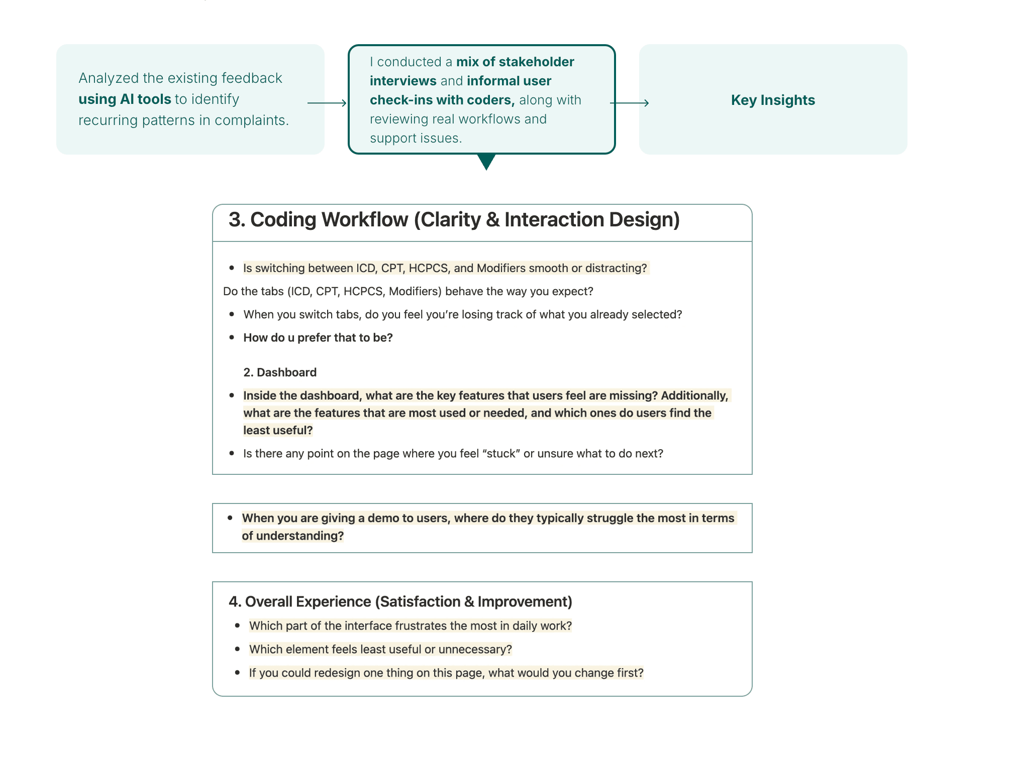
I analyzed existing feedback with AI tools to identify recurring patterns, then conducted stakeholder interviews and informal check-ins with coders while reviewing real workflows and support issues.

Codio AI research process showing feedback analysis, stakeholder interviews, workflow questions, and key insights

What we heard from users

  • Coders could not track their operational workflow. Import, validation, AI coding, review, and export stages existed technically but were invisible in the interface.
  • The dashboard was almost unused. Users visited it mainly to download reports because the remaining data did not support daily work.
  • Users built their own workarounds. Some tracked charts in spreadsheets, while others ignored extracted AI data and opened raw PDF charts in separate tabs.

Making the real chart lifecycle visible.

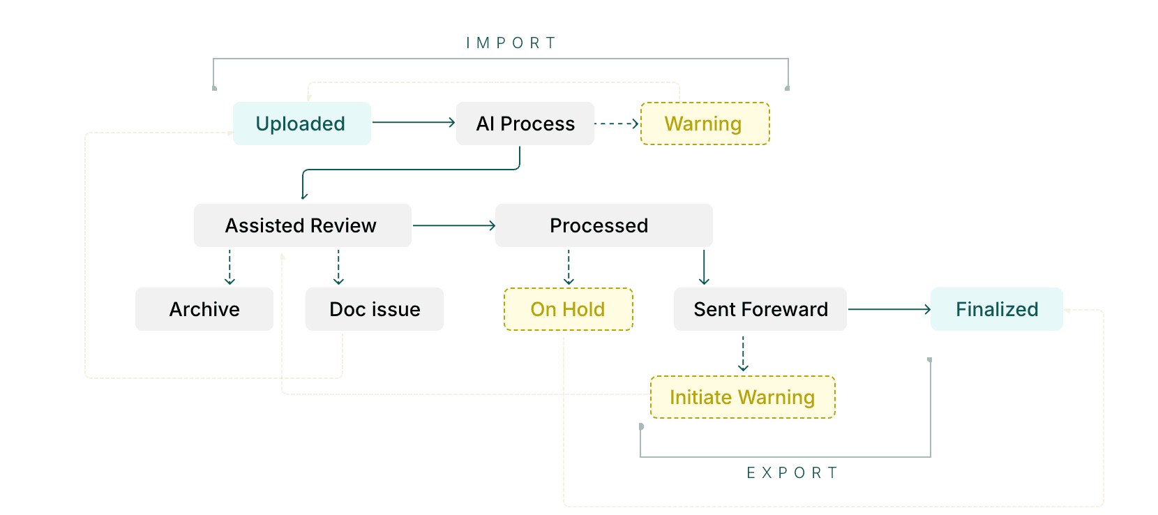
Before designing a better experience, I mapped how the system actually processed charts and every stage they passed through. The workflow existed inside the system, but no part of the interface helped users understand where a chart was within it.

Codio AI chart workflow from upload and AI processing through review, warnings, export, and finalization

This mapping became the foundation for the Workboard and established the operational language used throughout the redesigned product.

Four goals grounded in workflow evidence.

Make the complete chart workflow visible.

Reduce navigation complexity and page switching.

Improve chart-status visibility and discoverability.

Reduce the number of places users needed to visit.

I used AI design tools to generate multiple early wireframe variations from workflow requirements. The tools accelerated exploration, but the design decisions came from evaluating and combining those variations against user needs, workflow logic, and research evidence.

In many cases I combined useful elements from two options into a third direction that matched the coders’ daily mental model more closely than either generated starting point.

A single operational view for the entire workflow.

I designed the Workboard to bring the complete chart-processing workflow into one clear view. It combined workflow research, stakeholder insights, the system flowchart, and exploratory wireframes.

The process naturally divided into three clear stages: Import Queue, Coding Queue, and Export & Initiation Queue. A vertical card-based layout made each stage distinct and visible.

  • Understand where charts are in the process.
  • Identify missing, blocked, or stuck charts.
  • Track progress without switching between screens.
CORE DESIGN CHALLENGE

Operational density versus visual clarity

Coders needed enough information on every stage card to act without opening another page, but adding more information made the workflow harder to scan. The final direction reflected how coders described their daily work—not which isolated version looked cleaner.

Designing the workspace where coding actually happens.

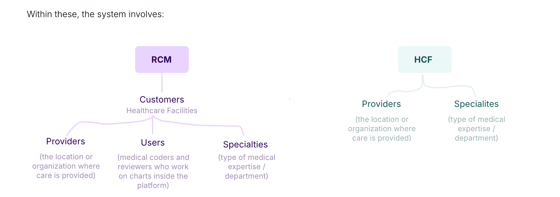
Once the Workboard made workflow status clear, I improved the chart coding and finalization experience. The platform primarily serves HCF organizations—hospitals, clinics, and medical centers—and RCM companies that manage billing and coding processes.

Codio AI customer structure showing RCM and HCF organizations, providers, users, and specialties

Coding panel — the main workspace

The coding panel lets users browse suggested codes, add codes manually, switch between ICD, CPT, HCPCS, and Modifier tabs, edit coding details, access notes and checks without leaving the screen, and move directly into final review.

Key actions remain visible, tabs organize dense information, and visual indicators distinguish AI suggestions from manual decisions so coders can move quickly without losing context.

Strong ideas that did not make version 3.0.

CONCEPT 01

User-coded versus AI-coded comparison

A side-by-side view would show what the AI suggested against what the coder assigned, creating a feedback loop for coders and the data science team. It was deprioritized because surfacing the comparison without disrupting the coding workflow required significant additional complexity.

CONCEPT 02

In-platform ticket raising and tracking

A built-in support system would replace external tools and give Super Admins visibility into ticket status, ownership, and resolution. It was deprioritized because it expanded scope beyond the core platform improvements.

Validated internally, with honest limitations.

Version 3.0 was completed and validated internally but did not go fully live during the engagement, so there are no post-launch adoption, task-completion, or support-ticket metrics.

Validation came from the people closest to the problem. The Product Manager, CEO, and Director of Coding understood the support complaints, workaround behavior, and onboarding friction in version 2.0. Their consistent alignment across review cycles was a strong signal of confidence in the direction.

What the project reinforced

  • In complex systems, align the product with how users actually work—not only how the interface looks.
  • Operational visibility can be more valuable than a conventional dashboard.
  • Healthcare product decisions require understanding the domain, workflow, and business model together.

What I would do differently

  • Start usability testing earlier.
  • Establish qualitative analytics from the beginning.
  • Validate navigation through tree testing.
  • Document a complete end-to-end user flow.

Designing a complex
operational product?

Let’s create a clear, efficient product experience that reflects how your users actually work.

Start a Project