Attorneys
Both decision-makers and executors within the platform.

GLOBALCODIO AI
GlobalCodio is an AI-native immigration case management platform built for law firms and corporations managing complex immigration matters.
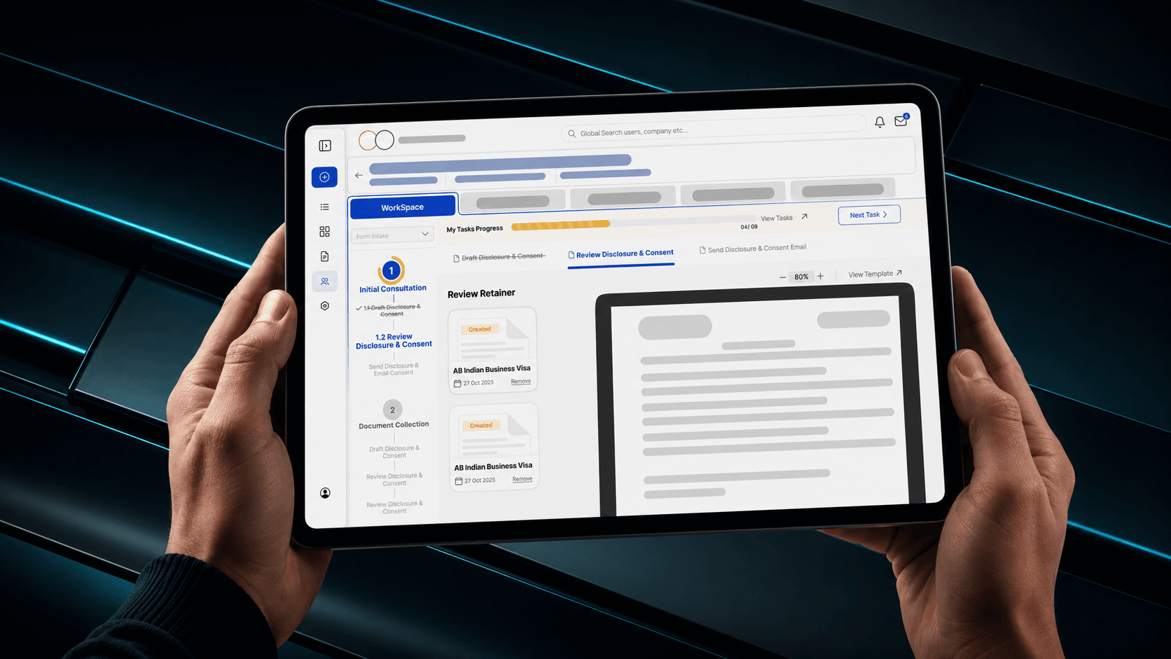
Due to NDA restrictions, this case study uses a recreated version of the interface.
THE PLATFORM
In a domain where a single missed document or delayed compliance check can derail a visa application, GlobalCodio brings together document verification, workflow automation, and legal compliance into one unified cloud-based system.
PLATFORM USERS
Both decision-makers and executors within the platform.
Work on specific milestone steps as directed.
Oversee case assignments and system-level operations.
Belong to corporate clients, not law firm staff.
The subjects of the cases.
Replace slow, error-prone manual work with AI-guided, auditable, step-by-step workflows.
Give firms visibility into every case, every step, and every document—in one place.
RESEARCH
Immigration law is a specialized domain. Before I could design anything meaningful, I needed to understand how immigration cases actually work—the stages, the documents, the compliance requirements, and the legal stakes involved. I spent time studying the domain deeply before opening any design tool.
UX AUDIT
I mapped every screen of V1, documenting the existing user flows, navigation patterns, and interaction models. This created a factual baseline—not assumptions, but documented evidence of where the experience broke down and why.
DEFINE
The client was more of a tester for us in the first two months. The PM had collected client feedback as a rough problem list from direct client meetings and emails. I took this unstructured input and systematically mapped it to specific parts of the product.
I conducted online observation sessions with users as they completed real tasks. I observed the Application Manager, PM, and development team members working through the product. I took detailed notes, documented exact pain points, and timed task completion. Screen recordings were taken for reference—no third-party tools, only direct observation.
IA & FLOWS
I created detailed user flows for every feature and every user type—attorneys, paralegals, and admins. This revealed dependencies, gaps, and unnecessary steps that were not visible in the UI alone. It was the most critical step before ideation.
ANALYSIS — PROBLEMS
The analysis revealed dependencies, gaps, and unnecessary steps that were not visible in the UI alone. Two major issues were blocking confident, efficient case work.
A single immigration case contained nine milestones and 34 tasks, but V1 presented them as a flat, undifferentiated list with no stages, no progress indication, and no sense of what came next. Attorneys working under legal deadlines had no way to understand where they were in a case, what was complete, or what needed immediate attention.
Attorneys do not think in tasks—they think in stages. “What phase is this case in?” comes before “What do I do next?” Instead of showing all 34 tasks at once, I restructured the workspace around a milestone-based hierarchy. Nine milestones became visible checkpoints on the left panel: a persistent progress trail showing exactly where the case stood.
Inside each milestone, tasks were revealed progressively. Completed tasks were visually struck through, the current task was highlighted, and upcoming tasks remained visible but locked until dependencies were met. A “Next Task” CTA removed the decision entirely, while a progress counter gave instant case-level health at a glance.
The product thinking shifted from feature-based navigation to workflow-based navigation. The system was now organized around how work actually happens, not how the database was structured.
Even with a better structure, task completion stayed low because of high cognitive load. Users paused for two to three seconds before interactions because actions appeared in different corners across 34 tasks. The interface felt unpredictable.
Users faced action paralysis because buttons were scattered inconsistently across screens, with some steps showing up to seven competing CTAs. By anchoring primary actions to a persistent bottom bar, I replaced decision friction with a predictable motor-memory pattern.
We turn complex operational systems into focused product experiences that teams can understand, use, and scale.
Start a Project →