
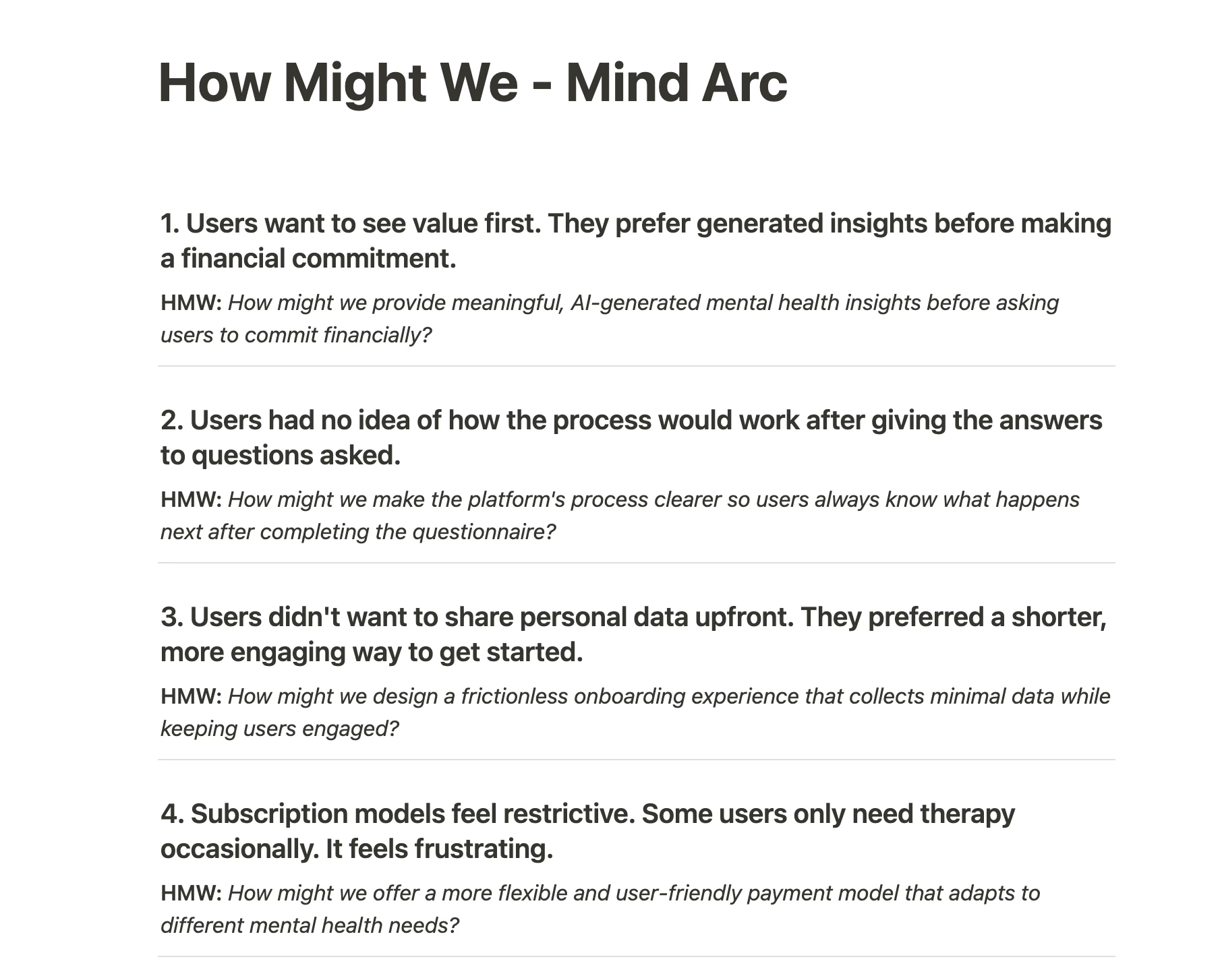
Users wanted to see useful insights before making a financial commitment.
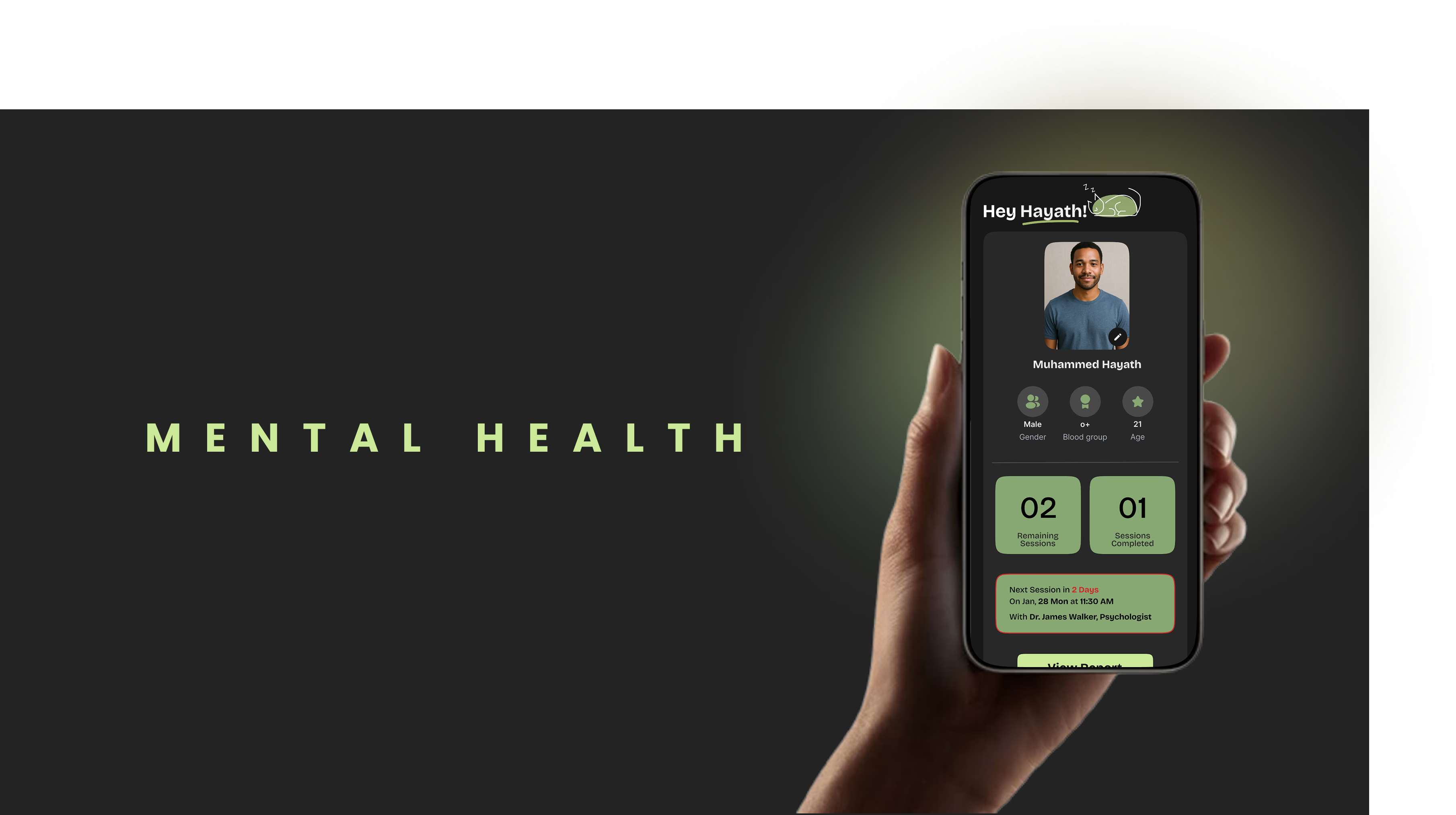
MIND ARC · MENTAL WELLBEING
Creating a Seamless Digital Experience for Mental Well-Being.
THE CHALLENGE
Make seeking help feel personal—not clinical.
Mind Arc set out to create a mental-health platform that helps people understand what kind of support they need, see meaningful value early, and connect with the right professional without pressure or confusion.
The work covered the full experience: research, information architecture, web and mobile design, prototyping, usability testing, and developer handoff.
01
UX RESEARCH
UNDERSTANDING THE BUSINESS & USERS
Replacing assumptions with direct user evidence.
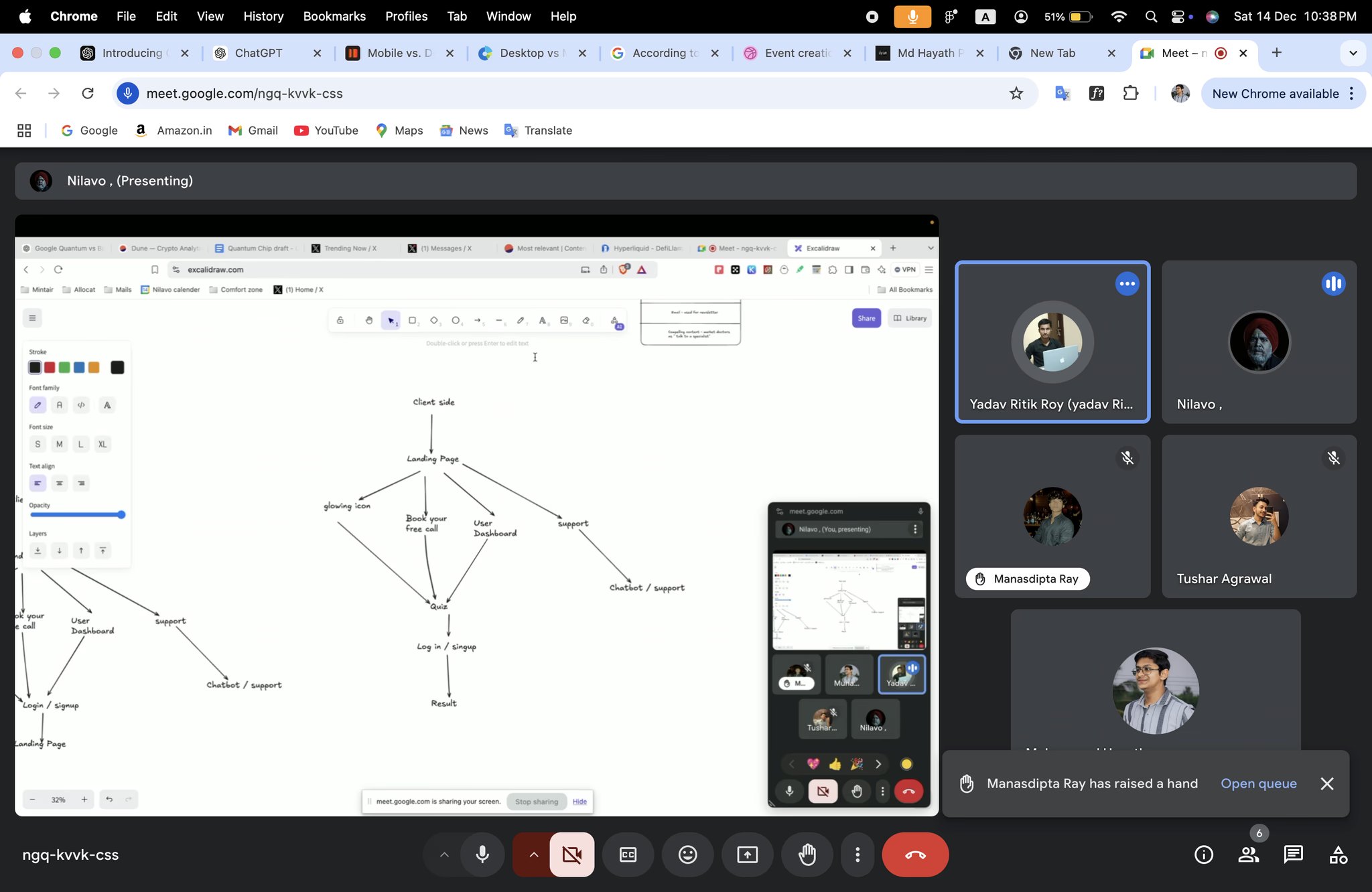
The project began with a client workshop to understand the Mind Arc vision and review existing mental-health products, including Amaha, Wysa, and BetterHelp. Because the category had few psychiatrist- and psychologist-specific experiences, therapist platforms became the research baseline.
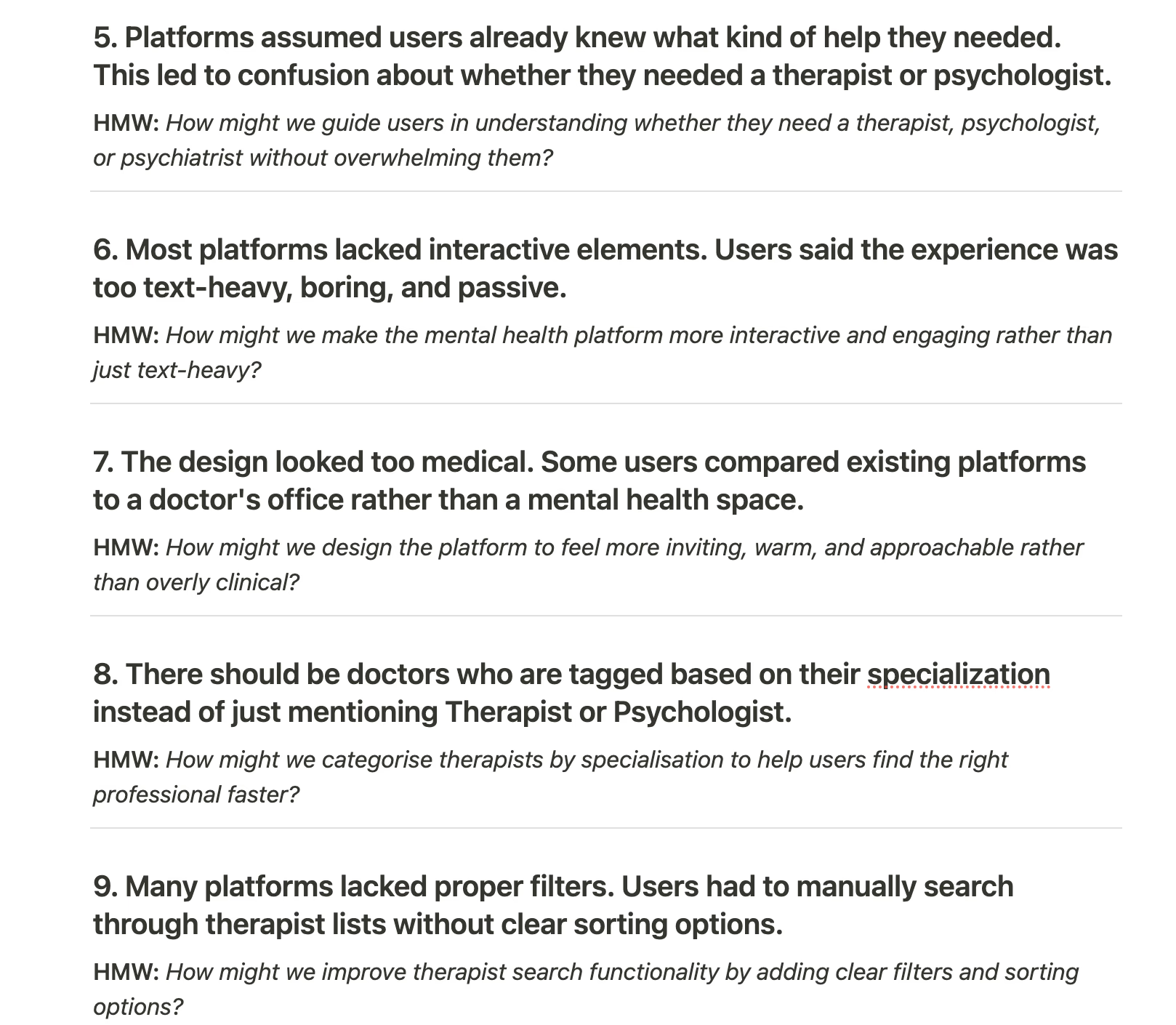
Seven user interviews were conducted. The raw conversations were organized through thematic analysis and affinity mapping, revealing repeated concerns around trust, expert selection, onboarding, payment, and the lack of support between sessions.
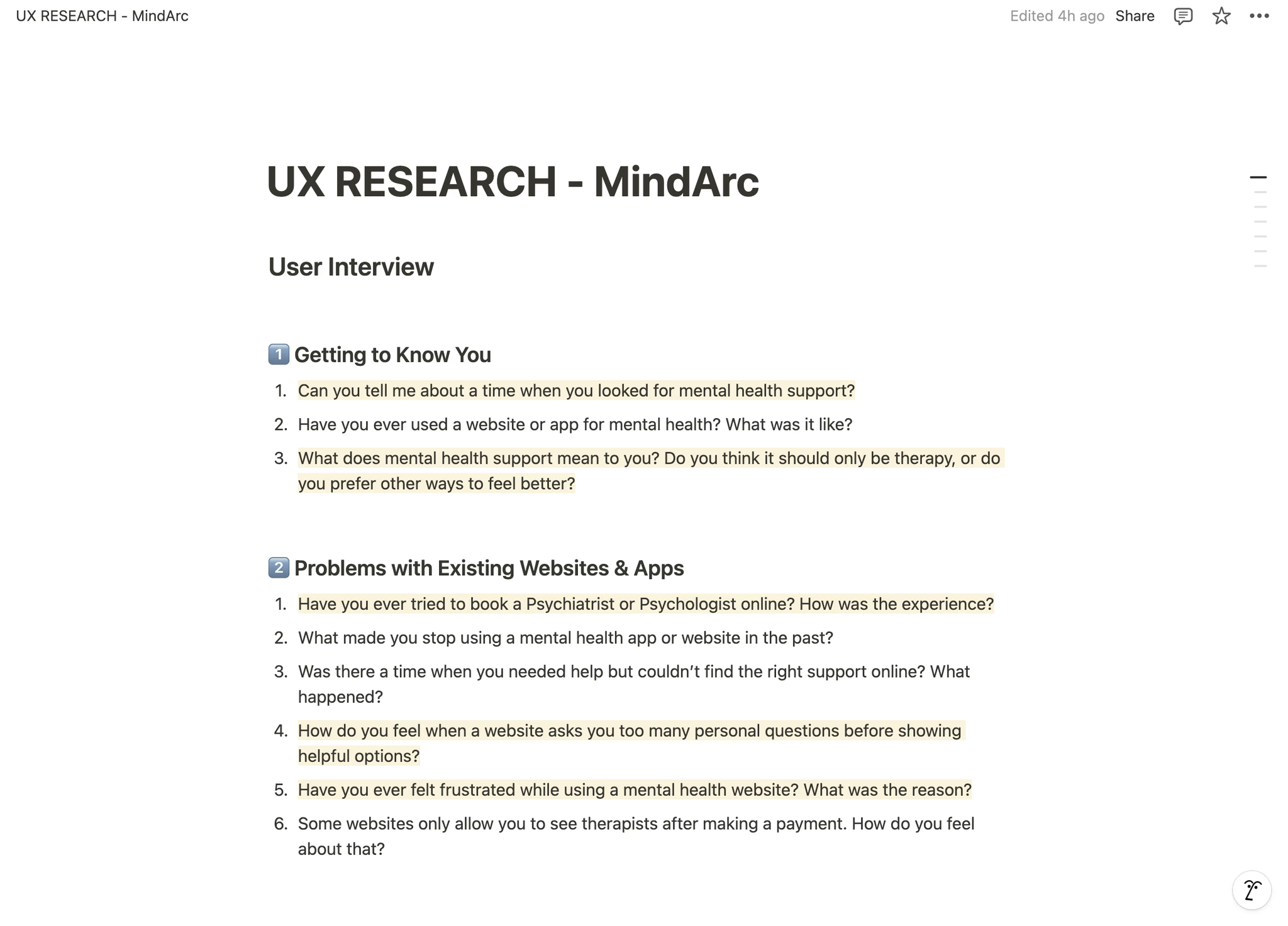
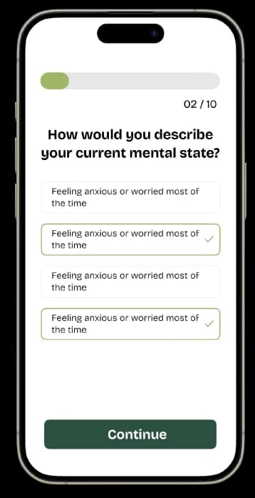
Long, personal onboarding questions created hesitation and early drop-off.
Text-heavy experiences felt clinical, passive, and difficult to connect with.
People wanted guidance choosing between a psychologist, psychiatrist, or therapist.
Users expected support between sessions through resources, goals, and progress tracking.
Unclear pricing, subscriptions, and refund policies reduced trust.
02
DEFINE & PRIORITIZE
PRIORITY GRID · HOW MIGHT WE
Focus first on clarity, trust, and a lighter way into care.
A priority grid organized opportunities by user impact and effort. The first-priority problems were the long sign-up flow, poor guidance when choosing an expert, pressure to pay before seeing value, and an experience that felt more like a doctor’s office than a supportive wellbeing space.
HMW
Core design question
How might we help people understand their needs, receive useful guidance, and choose the right professional before asking them to commit?
ClarityGuidanceTrust
VISUAL DIRECTION
Calm, human, and deliberately unlike a clinic.
03
UX/UI DESIGN
INFORMATION ARCHITECTURE · WIREFRAMES
Turn research into a simple, confidence-building journey.
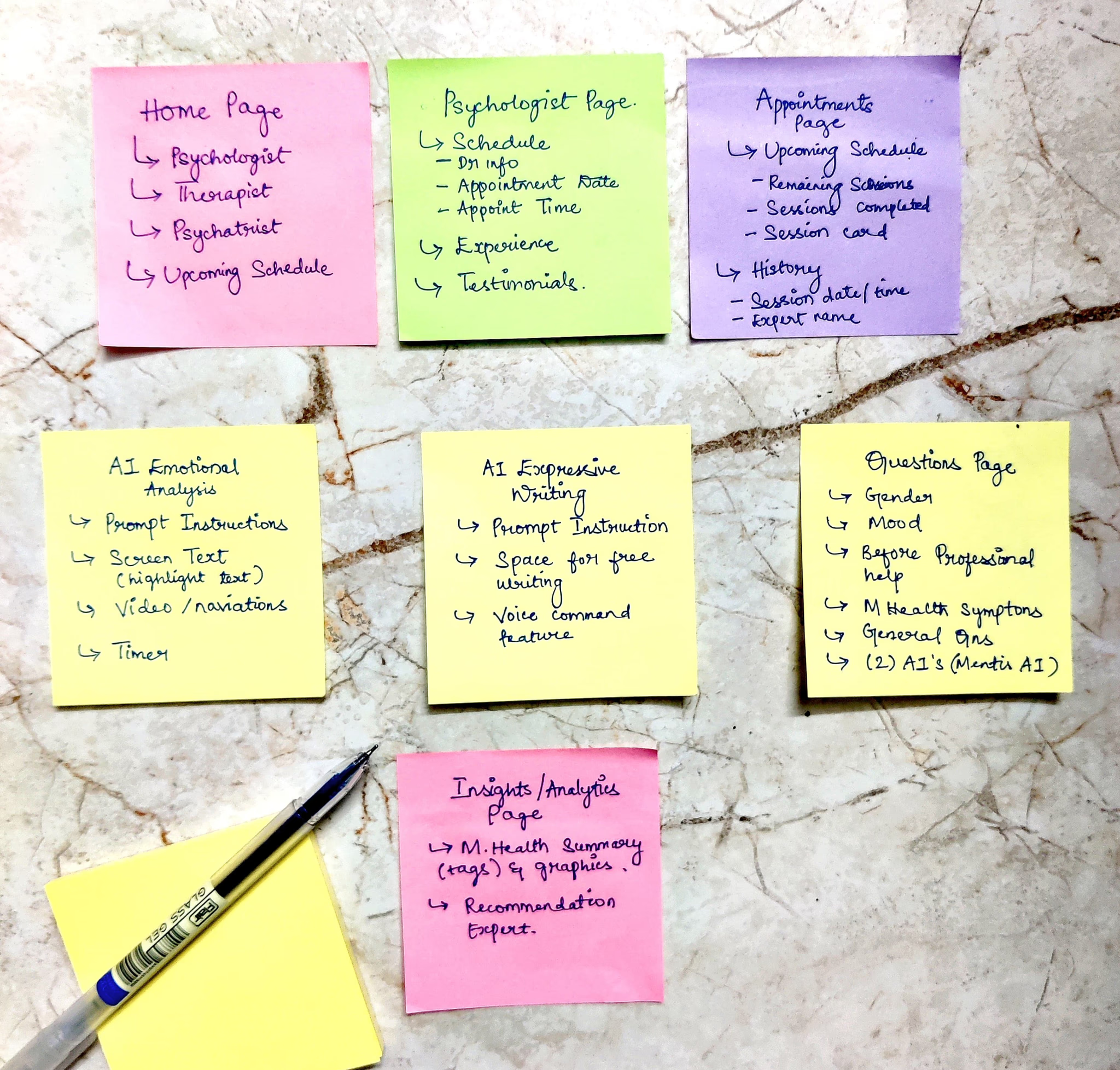
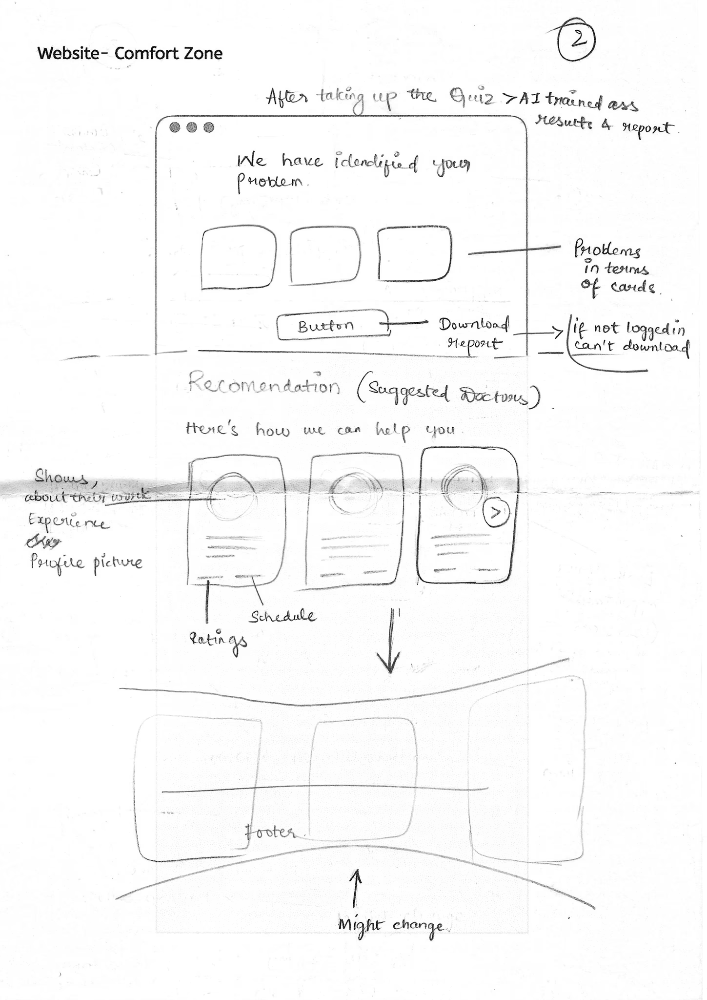
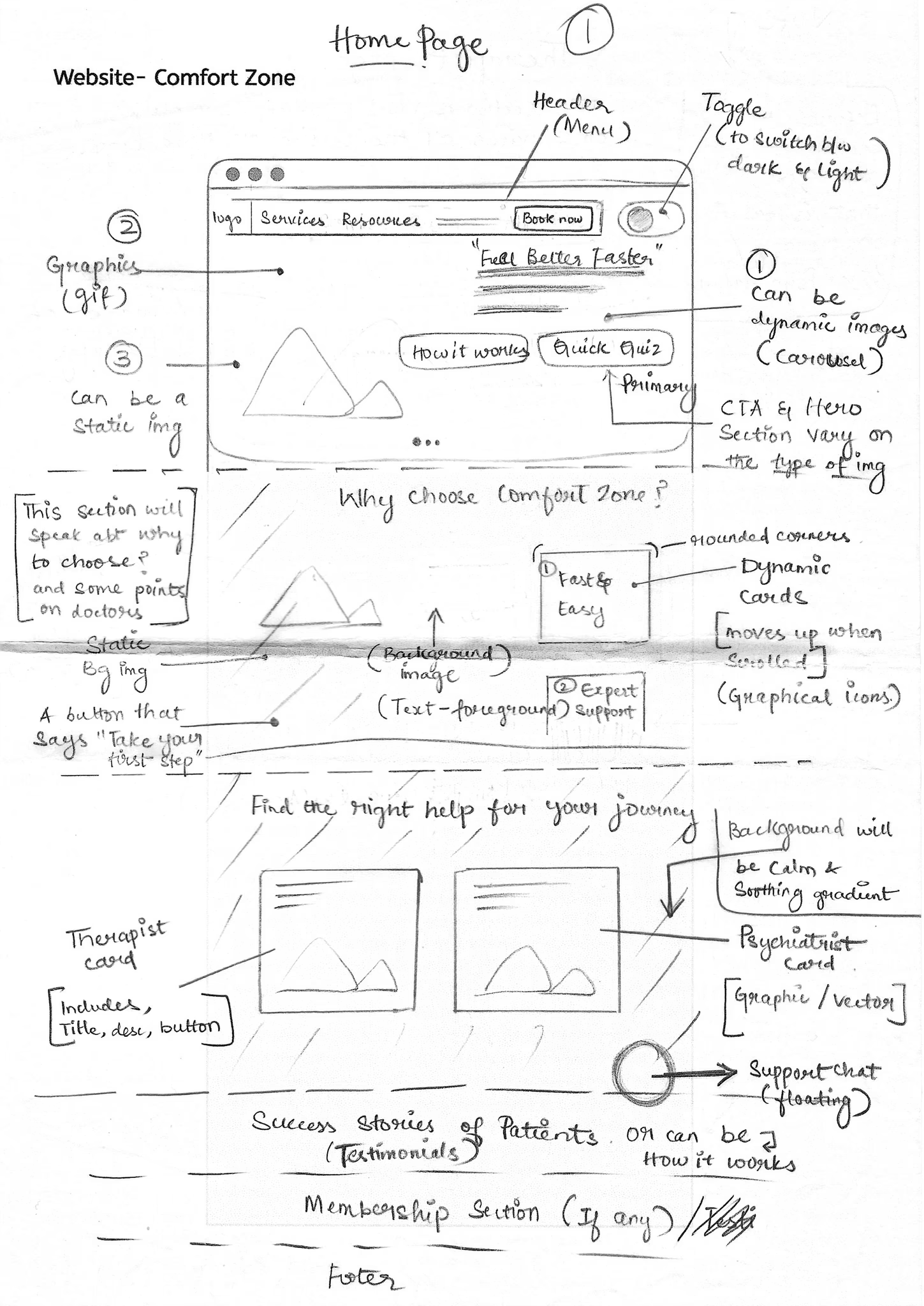
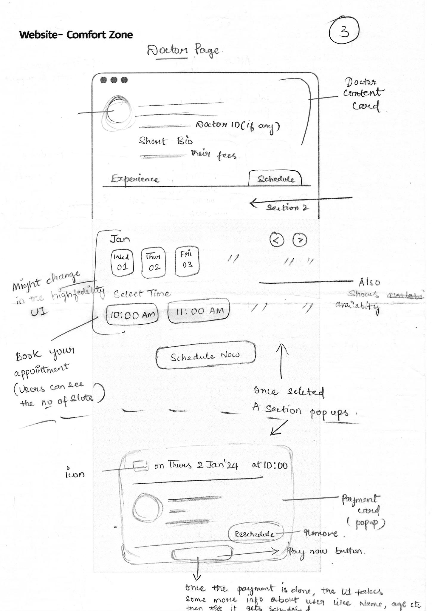
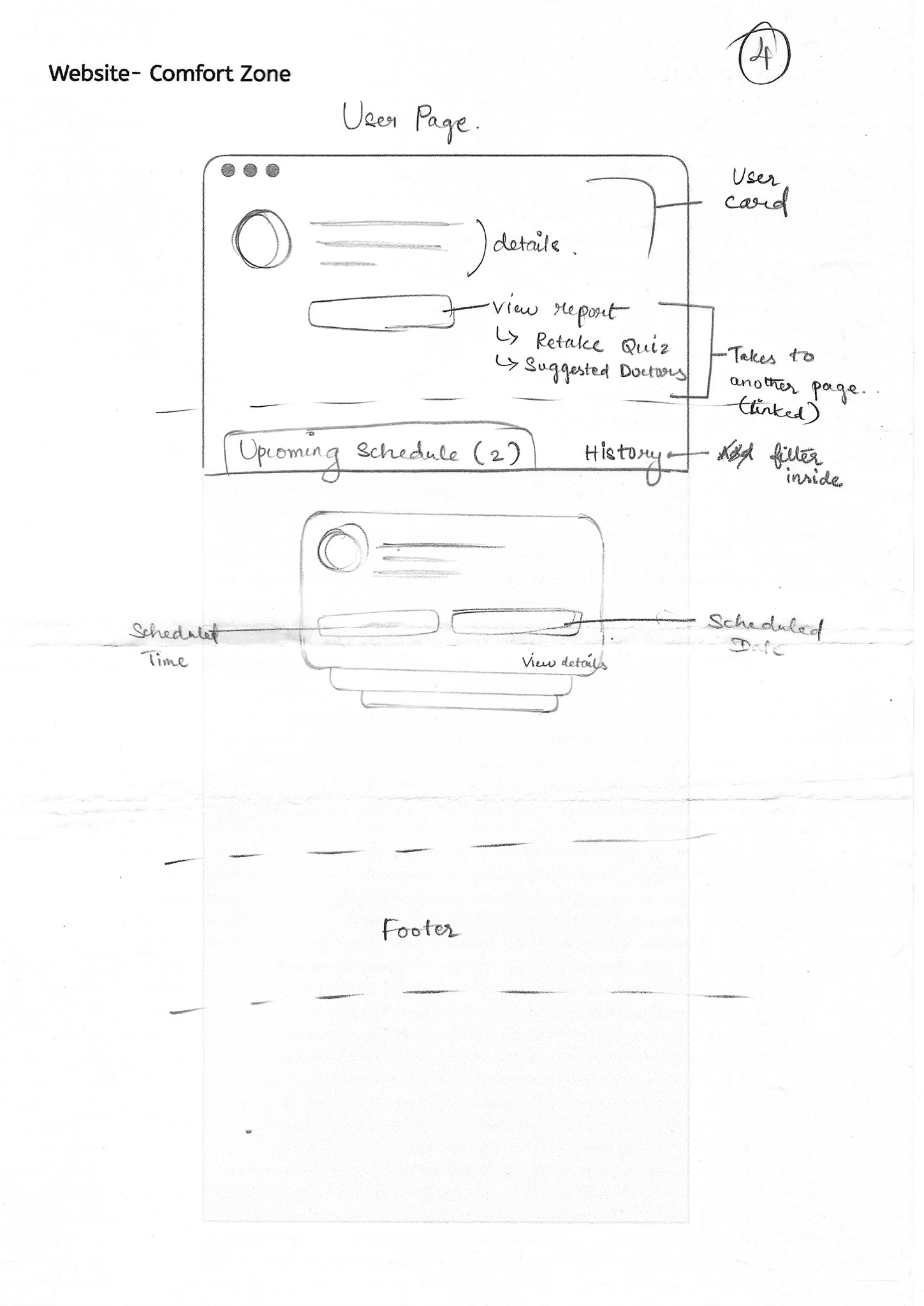
The information architecture and user flow established a clear path from first question to assessment, personalized insights, expert recommendation, booking, and ongoing progress. Low-fidelity wireframes then made the platform’s core functionality tangible for team feedback before visual design began.
DESKTOP EXPERIENCE
A guided experience that gives value before asking for commitment.
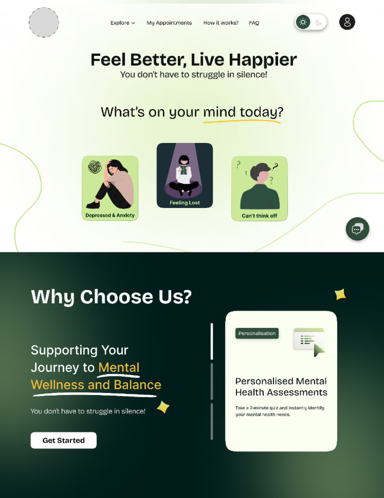
Question-based landing
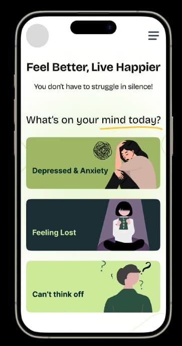
The homepage starts with a simple question, helping users express what they need without searching through clinical categories.
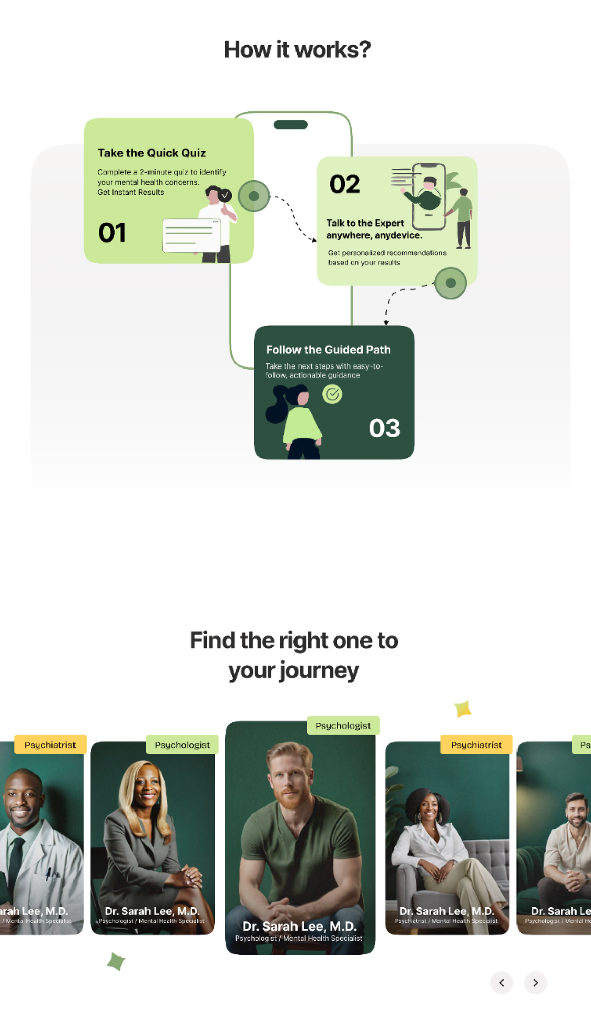
Three clear steps
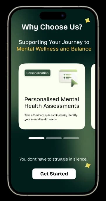
Users complete a short assessment, receive immediate insights, and connect with the right expert through a transparent flow.
Guided expert matching
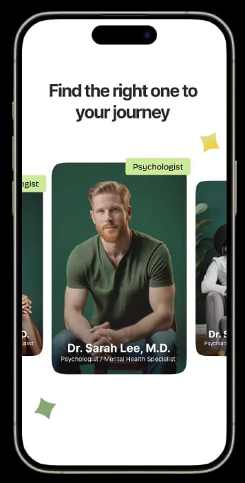
Psychologists and psychiatrists are color-coded and recommended from the user’s answers, experience needs, and availability.
Support beyond sessions
Appointments, progress, resources, and next steps live together so the relationship does not end after a booking.
USABILITY TESTING
Test, document, refine.
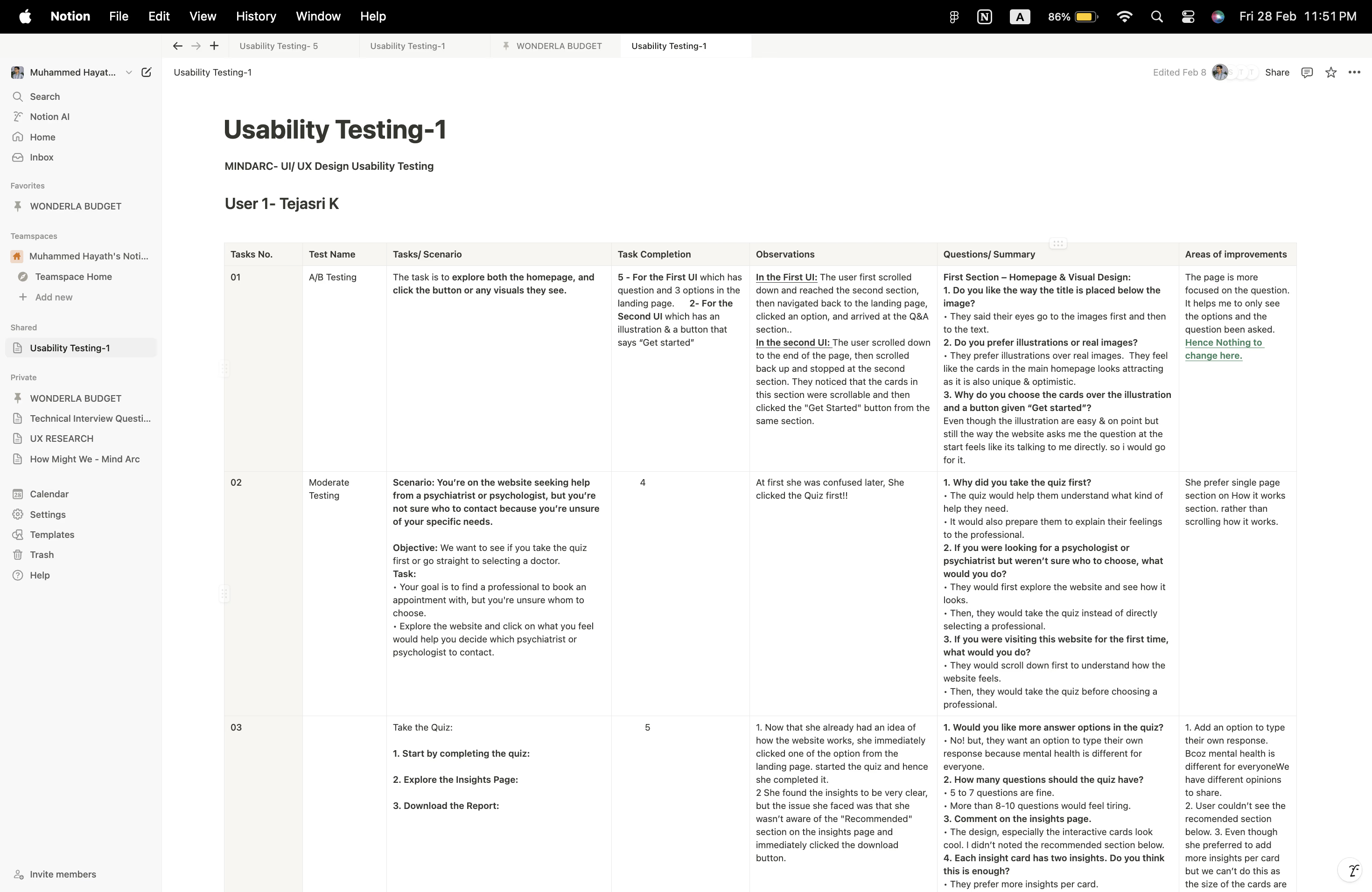
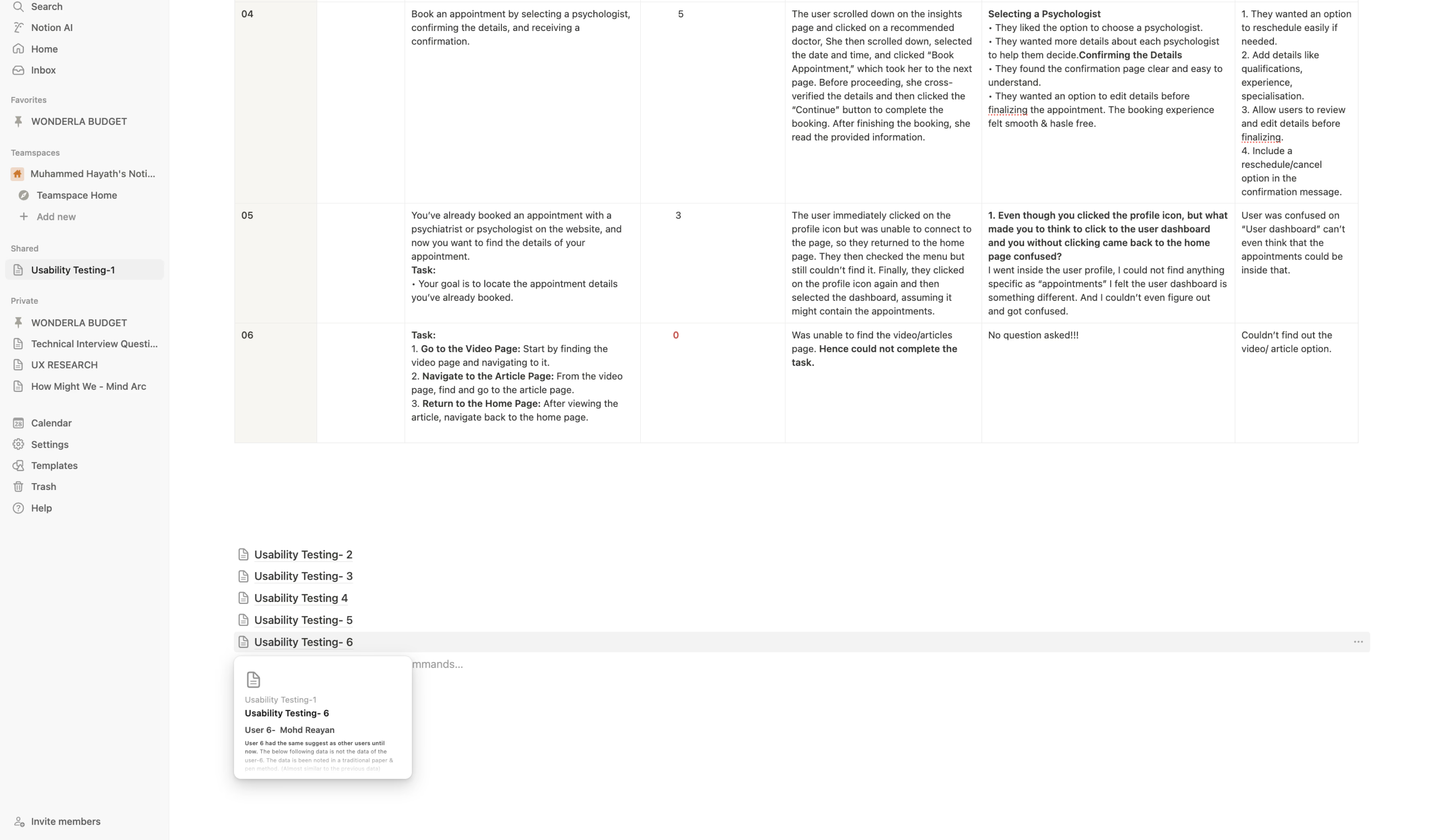
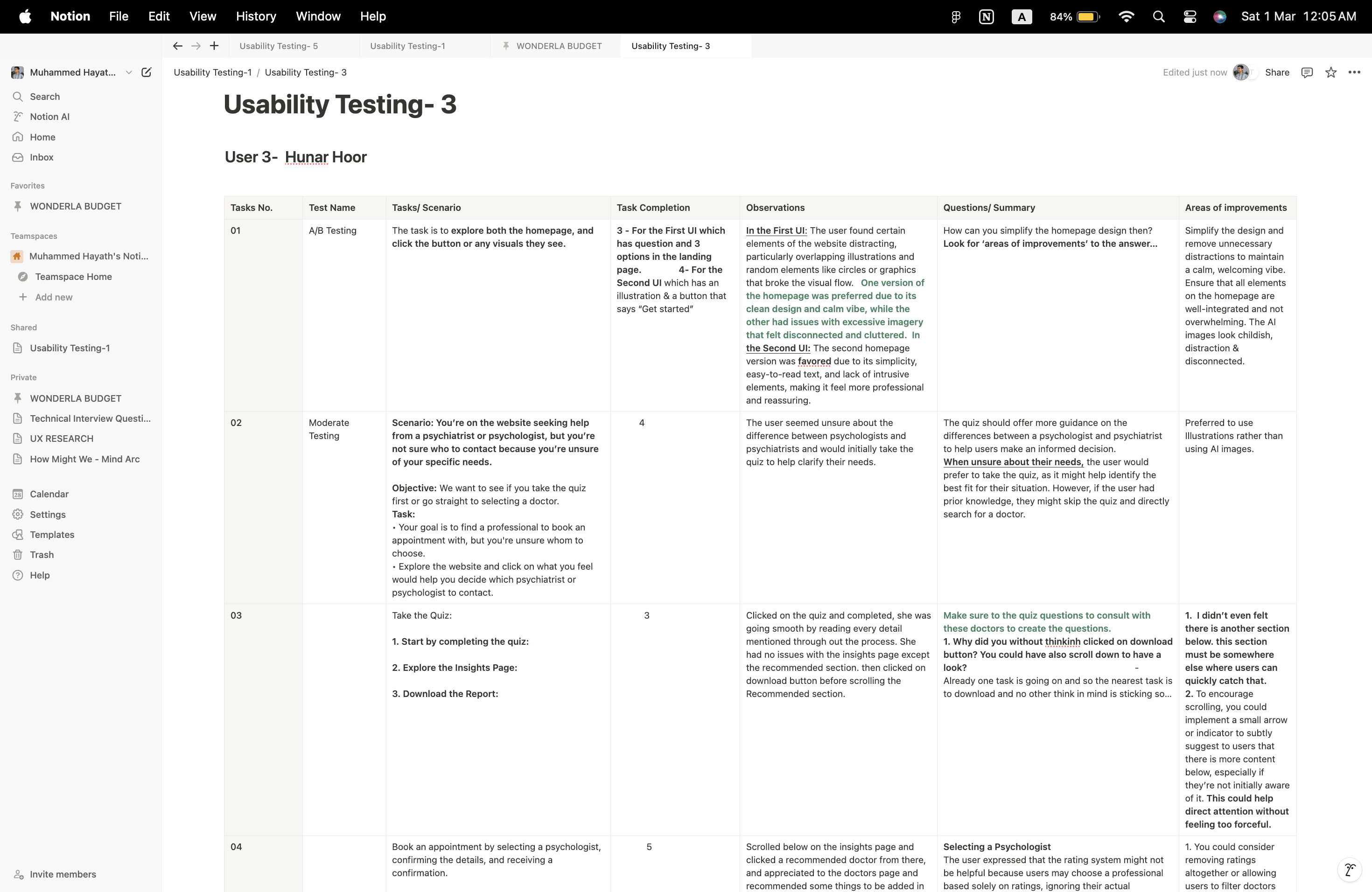
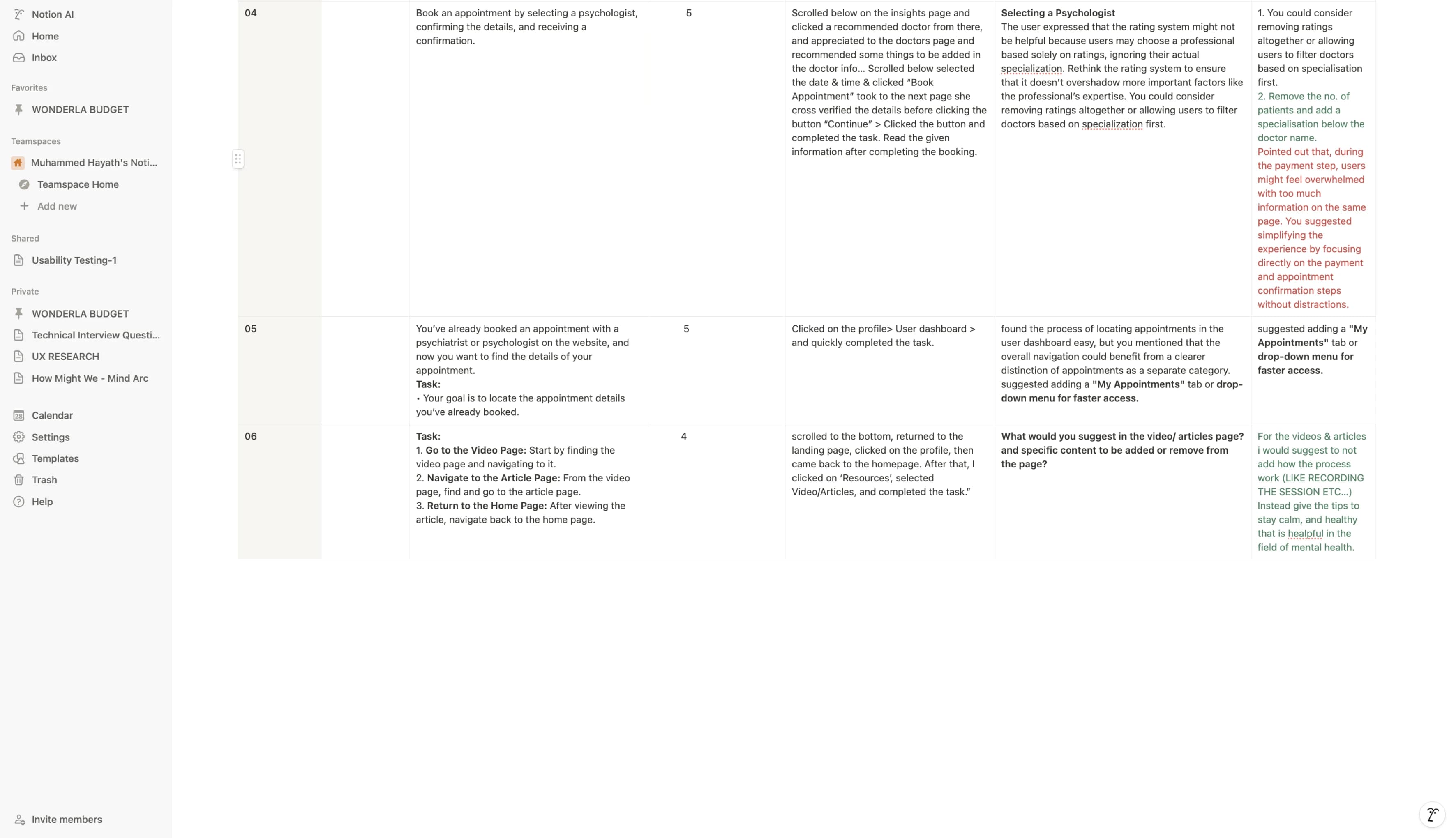
Once the desktop UI was ready, moderated usability sessions were conducted with six users. A/B comparisons helped identify the strongest variations, while observed pain points were documented, shared with the Mind Arc team, and translated into interface iterations.
- Clarified the assessment and what happens after it.
- Made professional specializations and availability easier to scan.
- Improved appointment status, next-session visibility, and progress tracking.
MOBILE EXPERIENCE & HANDOFF
The full journey, designed to travel with the user.
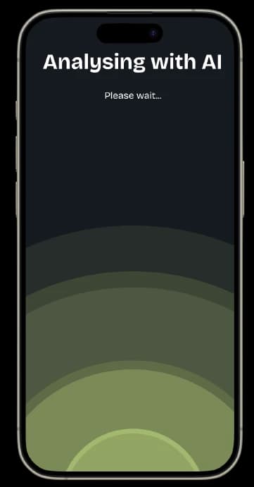
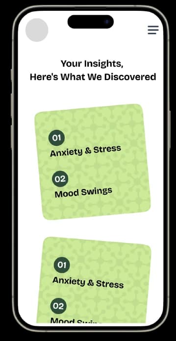
The refined desktop experience was translated to mobile, covering the homepage, questionnaire, flip-card insights, recommendations, doctor profiles, appointments, and AI analysis. Final designs were handed to the frontend team with close collaboration across backend integration and user-flow implementation.
Have a complex product
that needs clarity?
We turn research and product strategy into experiences people understand, trust, and enjoy using.
Start a Project →